How do we design great products & experiences that have good form and function? What is good design?
This page explores the design principles behind both well-executed and poorly designed products. I analyze them through the lens of engineering and human-centered design, and illustrate key concepts with concrete examples.
I discuss principles of design in the products I see and use every day, highlighting the best parts of each so as to become a reference for inspiration for new creativity.

I pull a lot of my knowledge from Don Norman’s book, The DESIGN of EVERYDAY THINGS. It is an excellent book that opened my mind to what design is and how we as “consumers” become increasingly reliant on technology as the end all be all. Improper use of a product does not mean user error, but instead bad design. If you’ve made it here, then you care about design and should read this book.
Table of Contents:
- good design
- No Emergency Access, Gate and Sign for Basement Floor at UVA
- Dog Poop Bag Refill Indicator Sticker
- Designing a CAD Template that Works
- Google's Happy Birthday, Mario! Message
- Intelligent Coffee Machine
- Caraway Cookware Packaging
- Trash Can Top Lock Using Bungee and Clips
- Self-Closing Bathroom Stall Door
- Band-Aids for All Skin Colors – Inclusive Design
- Inclusive Jewelry Shopping Feature – Inclusive Approach to Representation
- Pizza Cutting Guide
- Hallway Light Switch Cover
- Car Logo Factory Installation Jig
- Stand-Up Paddleboard or Kayak Cup Holder
- poorly designed products (or features) & suggestions
good design
No Emergency Access, Gate and Sign for Basement Floor at UVA
Design Safety, Human Behavior in Emergencies, Affordances, Reducing Cognitive Load
Jan 9, 2025
I bet this building design feature is required by standard code but I think it is an excellent design.
Imagine walking to the library/floor situated in this basement. You come across this gate with a clear “NO EXIT” sign and a gate that must be opened outwards, with no lock. You then continue to see signs on bottom floors that indicate where to exit. Chances are, you won’t forget that you can’t exit on the basement floor and that you must go up and out. And imagine an emergency situation where someone would have to run out, the gate is a one way gate that allows escapees to exit quickly by pushing in the direction of exiting traffic.
The outward-opening gate offers an affordance to pushing, signaling an exit route. The lack of a lock ensures that in emergencies, there’s no unnecessary barrier, aligning with the affordance of an emergency exit.
The “NO EXIT” sign and other directional signs provide clear information at decision points (stairway corners or at the top and bottom of the stairs). This ensures that users are not confused about where to go during normal use or emergencies. Signage on the basement floor reinforces the rule that exit requires moving upward, reducing cognitive load and potential panic during emergencies. The emergency sign is RED to associate a visual danger cue to the instruction.
The gate’s function corresponds intuitively with its context, where people fleeing in an emergency will naturally push in the direction of escape. The design incorporates a physical constraint by making the gate one-way. It prevents re-entry, ensuring that escape routes are kept clear and flow is directed toward safety. People cannot run back towards danger.
This is good, and safe design. I would add visual arrows on the signs to indicate where to exit.
⭐⭐⭐⭐⭐⭐⭐⭐⭐(9/10)


Dog Poop Bag Refill Indicator Sticker
Reminders, Visual Indicators
Dec 20, 2025
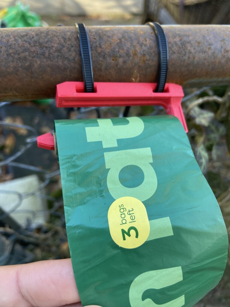
I was pulling bags from this roll when I noticed a “3 Bags Left” sticker on one of the bags. This particular company provided a simple way to indicate and remind a person that it’s time to get a new bag.
For further context, most people place this roll of bags into an enclosed dispenser, which really doesn’t provide a visual indication that the roll is running out. And even if the roll is exposed, it’s often hard to judge how many are left.
As a dog parent myself, running out of bags while on a walk is the worst. So kudos to this company.
⭐⭐⭐⭐⭐⭐⭐⭐⭐(9/10)
Designing a CAD Template that Works
Good User Experience, Checklists
Read my full blog post to read my analysis of this template I designed for myself at work.
As someone who works on engineering prints all day, and often rushed, I had to design something that worked for my brain.
Google’s Happy Birthday, Mario! Message
Good User Experience, Personalized design
This is such a simple feature within Google’s enormous list of UX/UI features, yet it caught my attention.
It’s my birthday today (I’m not giving the date because this is the internet😈). I noticed some confetti circling around my profile picture which prompted me pressing on it. A visual cue to prompt a specific action!
Once open, I was greeted with this wonderfully simple message wishing me a happy birthday.
Why do I care about this so much? It is not hard to implement in code but to me the human interacting with this product, it feels different to see a message wishing me a happy birthday as a part of the CODE ITSELF, the PLATFORM, GOOGLE versus receiving an email wishing me so…which is usually an advertisement or a prompt for me to buy something. I can’t change it or delete it like I could an email. There is permanence. So regardless of my opinion of large, trillion-dollar companies, there is a sense that Google cares enough to consider my birthday IN their product.
Good designers and engineers recognize that they are designing for humans, not users.
⭐⭐⭐⭐⭐⭐⭐⭐⭐⭐(10/10)

Intelligent Coffee Machine
Personable Design, Human-Experiential Design
I didn’t use all of the machine’s features but I did love this one obvious design element. The coffee and espresso machine had the best welcome screen. It doesn’t introduce itself to you with the initial screen of options and “please make a selection” in boring font. Instead it urges you to “design your morning” and “make your day.” Two powerful statements that are usually on inspirational posters or email signatures. The engineers and industrial designers knew good design principles when they coded this startup message screen.
To make the design even stronger, I would’ve included in script, the words “Let’s go” with a fingerprint icon centered with the words or some variation of this visual accordance.
⭐⭐⭐⭐⭐⭐⭐(7/10)

Caraway Cookware Packaging
Welcoming and Clear Packaging, Great User Experience
Let’s be honest, most cookware is pretty much the same. This was a wedding gift and it is a nice set. But what I found innovative was their packaging.
Apart from the massive waste of cardboard, I loved its packaging design so much.
There were several layers of the package within the main box, which came in a generic cardboard box itself just for shipping to protect the main package. Each layer had similar labeling and contained the lids, the pans, then the pots. The packaging walked me through what was included.
The aesthetically pleasing packaging gives me the perception that the product possesses high quality. If Caraway invested this much effort to design and engineer the package, then I can trust the quality of the pans themselves.
⭐⭐⭐⭐⭐⭐⭐⭐⭐(9/10)

Trash Can Top Lock Using Bungee and Clips
Simple design, Stopping (preventing) an Action
I came across a few trash cans in my neighborhood with this simple bungee “invention” fashioned to them. This is not the default design by the way.
I believe it’s meant to keep animals out or “illegal dog poop bag ditchers” away also.
My only redesign recommendation would be wrap around the can and instead of the crimps, stretch and knots them. This would save material of both the crimps and bungee cord.
⭐⭐⭐⭐⭐⭐⭐(7/10)

Self-Closing Bathroom Stall Door
Good Mechanical Engineering & Industrial Design, Intractability
This was a stall door in a random Starbucks bathroom. You may have seen this hinge design in many different bathrooms.
The design includes two sides of hinges each with grooves that “fall down with each other” when the door is shut. This design allows for the door to automatically shut behind you because the hinges will want to return to this equilibrium position.
Both sides of this hinge is also created the same way meaning that you need to manufacture one side and simply include two of them as the product. There’s the same part made twice and they attach with a simple rod that slides through all the different grooves.
It’s an excellent design meant to keep the stall doors closed possibly for safety reasons or aesthetics. The engineers who created this created a simple, effective and elegant solution.
⭐⭐⭐⭐⭐⭐(6/10)


Band-Aids for All Skin Colors – Inclusive Design
REAL Human-Centered Design, Design for Inclusivity
Apparently these have existed for some time but this was my first time hearing about it. This is a beautiful redesign of an old product that has looked the same way for a long time.
Inclusive design seems to be “in” right now, but this is what design is and should be. I would argue that the original band-aid was a poor design to begin with because it asserted that they are a one size fits all. I suppose it’s true in some aspects, but culturally and racially they excluded. Inclusive design is pure design. Exclusive design is an intentional choice.
⭐⭐⭐⭐⭐⭐⭐⭐⭐⭐(10/10)

Inclusive Jewelry Shopping Feature – Inclusive Approach to Representation
REAL Human-Centered Design, Design for Inclusivity, UI/UX
I saw this feature on Brilliant Earth when looking for wedding bands for my wife and I. Most online retailers have white or caucasian models presenting their jewelry, therefore it was about damn time and refreshing to see this feature. The online UI/UX design is simple – a slider for lighter and darker. The coloring is also accurate and beautiful.
Jewelers have a long way to go in their advertising with respect to inclusivity. It’s a start. Thank you Brilliant Earth.
Please see my comments for “Band-Aids for All Skin Colors – Inclusive Design”! There, I discuss the philosophy and bug picture of inclusive design.
⭐⭐⭐⭐⭐⭐⭐⭐⭐⭐(10/10)


Pizza Cutting Guide
Simple Design, No Technical Skills Required Needed, Repeatability
This is a device that aids in repeatability to a task that could potentially take practice or special awareness which not every part-time employee possesses. Imagine needing to slice pizzas in a kitchen that isn’t used to it (Costco vs. Pepe’s Pizzeria), or when presentation is crucial (places that sell by the slice); repeatability in an efficient manner is required.
This saves time because no training or thinking is needed. When you remove cognitive load for people, they make fewer mistakes. Not many people can visualize the 8 slices on a full circle, or to methodically understand to half it, then half the halves, then once more…
Overall, this guide saves food and increases sales for the store because fewer mistakes occurs. I need one for my kitchen!
Amazon link to purchase one! Note, this is an affiliate link that doesn’t impact you!
⭐⭐⭐⭐⭐⭐⭐⭐ (9/10)

Hallway Light Switch Cover
Interrupting/Stopping Human Behavior, Reducing Errors in Design
This is a simple product. The switch cover was found in the stairway of an apartment’s stairwell I assume to guard the switch from being touched when moving things to your floor. The stairwell lights are automatic so I assume the landlord wanted the switches constantly on as to not interrupt the automatic function.
⭐⭐⭐⭐⭐⭐(6/10)


Car Logo Factory Installation Jig
Jig, No Technical Skills Required Needed, Repeatability of an Action
Analysis coming soon!
⭐⭐⭐⭐⭐⭐⭐⭐ (9/10)
Stand-Up Paddleboard or Kayak Cup Holder
Simple Design, No Modifications or Technical Skills Required
Analysis coming soon!
⭐⭐⭐⭐⭐⭐ (7/10)

poorly designed products (or features) & suggestions
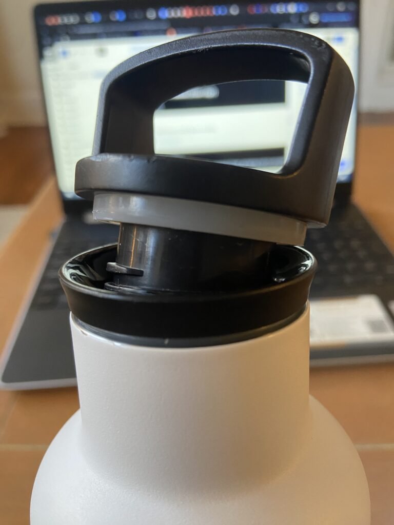
My Insulated Water Bottle (Filter Cap?)
Poor Consideration of Human Physiology/Anatomy
Jan 12, 2025
I love this insulated water bottle except for one major issue which is that the first section/filter cap has no effective way of turning once tightened on the bottle. Getting it on is easy and often results in overtightening which makes filling it with ice or water nearly impossible, or under-tightening results in both caps coming off simultaneously this defeating its purpose.
When I tell it is impossible to remove, I mean it requires a rubber gripper and an excessive amount of torsion to remove and I’m pretty strong. Why couldn’t the engineers who designed it have simply added a small extruding piece (as pictured) or grooves along the sides?
Design requires that we consider the humans who use it will not necessarily consider the minute torsional forces that are required to find that sweet spot to prevent it from locking up or being too loose. We also have to consider the frequency of refilling, or the age or grip agility of the people using the product.
Here is my redesign of this cap – a simple finger gripping nub to provide leverage to screw and unscrew it for fill-ups or to add ice.

The bottle is Designed in the USA, not built here. Therefore I imagine this company simply purchases a generic bottle from a cheap manufacturer overseas and they are happy with their revenue and profit margins; so why bother with redesigning or sourcing a better bottle?
⭐⭐⭐ (3/10)


Breville Espresso Machine Descale LCD Screen
Lack of Feedback, User-Error Management, Unclear Instructions
Jan 20, 2025
I am only critiquing the self-descale operation of this machine. I think in its other ways, it is relatively well-designed in terms of function and user-interaction.
The machine alerts you when it needs to be descaled, which is great for combatting forgetfulness. (Positive)
But descaling is a process which requires manually changing settings and pushing buttons with the only visual cues for these actions is a flashing LABEL. For example, the machine’s cleaning sequence stopped, with a large D2 and a flashing STEAM indicator on the display. But we didn’t realize it was waiting on an action to proceed until 20 minutes of waiting and silence. A quick Google Search later with its generative AI feature and found that it means we needed to switch the knob to STEAM. This machine resumed its operation.

The engineers designed its UX (user experience) to serve engineers, not their target audience. Sure, a flashing STEAM indictor could lead some to turn steam ON, but probably after pushing other buttons randomly or strategically. My point is, good design would ensure that asking the product user to commit to cleaning your product should at least provide more information and not assume that:
- Some has the user manual readily available or at all, has to look up the instructions, or do either mid-operation!
- A flashing keyword indicates the action needed/operation (i.e. STEAM means to switch to the steam function, or WATER means to switch to hot water). There indicators are not intuitive to the average product user.
- Someone understands or remembers how to do it. Forgetfulness leads to error and often damage to the machine or injury. In fact, we had no idea the machine was automatically switching to water from the steam tube that it shot all over the floor and on our legs. Water could come from the portafilter or the steam wand.
The operation apparently is forced on the user from the machine after a certain number of cycles or hours of use. So imagine a scenario where someone is given the prompt to begin the cycle right as they are wanting to make their morning coffee. So being caught off guard, an immediacy of action without feedback on how long it would take and no time to obtain the instruction is poor design.
My redesign suggestions to you @Breville:
- Instead of labels such as STEAM or WATER which provide no information, consider adding labels like “SWITCH TO STEAM” or “SWITCH TO WATER.” This adds context because a product-user will be familiar with the operation of “switch” because they switching to steam or switching to hot water is a familiar operation on this machine.
- Do not assume the product-user grabbed the manual and is following along!
- Time feedback – A progress bar providing feedback so you are not standing in front of the machine and not knowing how much longer.
- Add a label, possibly under the progress bar, stating what stage it is currently on. That way you don’t get hot water all over your counter or get burned!!
- Audible beep sound in the case of a product user stepping away for a second.
- Add another label to prompt adding a cup, or moving the steam wand if needed.
Of course, you could argue that this is too much work for a simple function. And to that I would respond with “know who you are designing for.”
⭐⭐⭐⭐ (4/10)

Bathroom Air Dryer Which Looks Like a Liquid Soap Dispenser
Poor Consideration of Human Mental Models
Jan 24, 2025
The machine itself operates well enough. Although there isn’t a label or decal indicating where to place your hands, there is a design affordance of that jetted feature which to some looks like a nozzle where the air comes out of.
My complaint with the design is that you have no indication that this small metal box is a hand dryer. It is the same size and shape as a liquid soup dispenser, it located very close to the sink and doesn’t have any sticker, logo, etching, or otherwise indicating signifier to explain what it does. Typical mental models tell you that this could be a hand dryer because it’s stainless steel, but other models could remind you of a soup dispenser.
How I would re-design or reframe this product:
- Install it above the trash can OR place the trash can underneath it.
- Add a very simple embossed or engraved universal symbol showing what it does and WHERE. (💨 or a wavy arrow symbol pointed down where the air comes out of)
- Shape the outer case to look slightly different from a soup dispenser.
⭐⭐⭐⭐⭐ (5/10)


Electronic Bathroom Door Lock
Human Behavior & Forgetfulness, Signs
I have some issues with doors having coded locks that also require you to use a separate deadbolt.
David Schwartz, of the book, The Design of Everything Things, mentions that a product or system has bad design if you need to create a sign with instructions detailing what a potential user of the product ought to do. In this case the restaurant went for a giant sign to communicate the message. I wonder why they needed it to be this big? (Haha!)
My potential redesign would be to add a button on the inside with two LEDs on the inner and outer sides of the device. A person entering the bathroom will see if the bathroom is locked or not based on the outer LED color and once inside, push the lock button which will change the status.
That or potentially adding the deadbolt to the electronic lock itself.
⭐⭐⭐⭐⭐ (5/10)

Hand Dryer – aka the Germ Spreader
Signs, Poor Location of Controls, Feedback Mechanisms
Once again; David Schwartz in The Design of Everything Things, talks extensively on how creating custom signs to explain how to use a product is an indicator of bad design.
This one was particularly obvious, and bad. Not only does the dryer not afford all the obvious indicators or affordances of where to place your hand, but the backup button is in a spot that gets direct access to water and germs. You can even see the mildew/mold on it. So the option is to touch this dirty button which requires you to squat, read the labels and then press the correct switch option; and I suppose you need to shut it off.
I believe at the time it worked for me, but only after waving my hands in random motions until I figured out where to wave.
My redesign would be to include a clear visual affordance to indicate where to place your hands. This could be achieved with a simple colorful LED light that goes on when hands are places underneath and/or a simple embossed arrow as a sign or an indent/curved area slightly larger than two hands to show the exact area to place your hand.
Next; I would add the button on the side of the machine. No longer would there be a need to look underneath for the button or have the button be in a germ-infested area.
⭐⭐⭐ (3/10)


Eco-friendly/Human-Unfriendly Toilet Flush Handle
Human-Behavior and Design Mismatch, Signage
I’m all for a water saving device. But seriously, why couldn’t a little more thought be put into the design, especially with how humans would interact with this product. As a public bathroom user, I usually don’t touch the flush handle with my hands. It’s usually with my foot or if I had to with my hands, but regardless of how I always push down.
People are more likely to urinate than other bathroom actions (this was a single toilet bathroom found at a university). People are more likely to flush the toilet for urination compared to other times, so why not flip the value over (and the sign) so that a typical user who is flushing with their foot, simply do the “normal” action which yields the correct flushing result. Or how about down for less water and forward towards the wall for more water. Both equally simple actions and can be followed without resistance.
Good design must respect human behavior. Trying to force humans into an unnatural, new way of doing things yields frustration or simply ignoring the required action.
And instead of the complicated sign above it which takes at least 45-60 seconds to fully read and process, why not have a small blue plastic clip that clips into the round part of the valve behind the handle; where the upper part has a cut out with the three drops icon and the bottom part with the one drop icon. Simple and stupid.
I would argue that up and down are simple tasks to model in a placard and then in real life. It’s also easy to engineer. But I think they could’ve done a better job at incorporating human behavior into their design.
⭐⭐⭐⭐⭐ (5/10)


Bathroom Emergency Pull Cord Cover
Unsafe Design Features in an Emergency Situation, No Feedback, Poor Visual Cues
Firstly, I think this particular bathroom is out of compliance and technically not legal whatsoever.
Aside from that, how the hell do you know what function does what with that switch? Is it on or off? There is no visual affordance to indicate the choices, the switch doesn’t reveal a different color nor is there a mark on either side.
The engraved text “pull for help” should be bigger, thicker or filled with white or red paint to show the text for those who are visually impaired or whose vision isn’t clear in moments of emergencies. Also, simply looking at the plate cover, you are distracted by the brand, the rivets, the screws, the switch and string. The ordering of these features should be different to avoid robbing a person’s attention looking for the important features (string and emergency instruction). The label should be bright and large, above the string and they should be at the very bottom; in case someone is on the floor or with their face down while on the toilet.
⭐ (1/10)
